We have listened to your feedback (some of you are not shy!) and in the next couple of weeks we will bring you the world’s most flexible budget editor (we aren’t shy either!) and simpler dashboard editing. We’ll make it easier to add tiles to your dashboards based on common templates so that you can create the dashboards you need quickly and easily.
New in Calxa: Flexible Budget Layouts
With budgeting season well underway, the changes to the layout of the budgeting grid will help many Calxa customers.
What do Traditional Budget Layouts look like?
We have all done budgets in spreadsheets at some point in our lives. For those of you who have been using Calxa for the past 13 years, it may be a distant memory but for some it’s much fresher. You have a column of accounts down the left side and months across the top. And probably a separate tab for each business unit or job or cost centre.
Often, especially when you are first creating a budget, that’s a useful way to look at your budgets. You work your way down, setting the budget for each month for your income accounts, your cost of sales accounts and then your expenses. Maybe you look at the balance sheet budgets later.
In Calxa, that is still the default budget layout because it is what people are familiar with. And, as we said above, it’s useful when first creating a budget. However, when editing an existing budget, you often want some twists and turns.
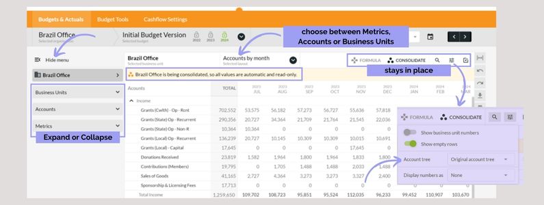
Here is the new Budget Layout Look
Based on feedback over a prolonged period, we have put together comprehensive improvements.

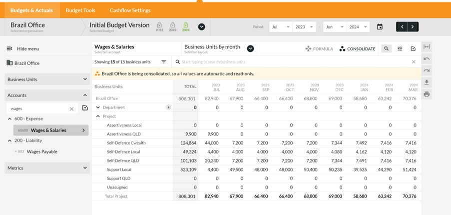
Now, at first glance that looks fairly standard but take a closer look at the left-hand side. Select Accounts and you get this:

Choosing Metrics on the left gives you those by business unit, by month, quarter or year.
Keeping the Budget Layout Consistent
As we said, we have listened to your feedback and you like to know where the Formula button is, where the Options button is. We promise not to move them around again, ever!
No matter which view you choose, the buttons for formulas, consolidation settings, searching and filtering, options and bulk actions will stay in one place.
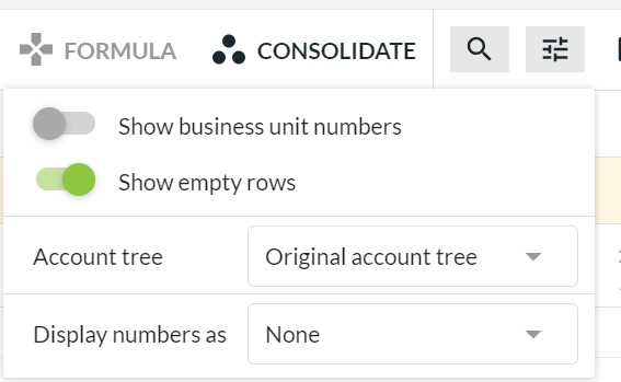
Moving Account Trees to the Options Menu is New in Calxa Too
We have moved Account Trees under Options to make it easier for you to find and then choose the layout for your budgets. You’ll also find Display options here.

Bulk Actions will allow you to expand or collapse accounts as you need (according to the account tree you are using) and to hide or show inactive accounts. Ctrl-I will toggle inactive accounts too.
New in Calxa: Next Step for Dashboards
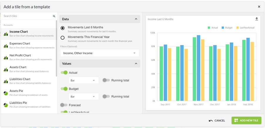
Tiles and templates are next on our dashboard agenda and they should make it much simpler to customise your dashboards to get the information you need.

We are in the testing phase and the release is not far away. You will get the usual message in the app when it is ready.
What can you do with tile templates?
When you add a tile, the steps are simple:
- Choose the chart type that you need
- Select the data source and filter it
- Pick the values and how you want to display them
- Decide what you want on the X-Axis
- Give it a title and add it to your dashboard
You’ll then be able to make further changes with the advanced editor if you wish but we expect most people will get what they need from the template.


.png)


