Well, by now you will have seen what’s new in Calxa. The first step in our dashboard overhaul with the introduction of the new pre-set dashboards is now live. There is more to come in the next month so let’s have a walk through the 3 stages of the release.
Stage 1: Pre-set Dashboards
In February we expanded our dashboard capability by adding some pre-set dashboards for Cash Management, Financial Position and Profitability. We’ve designed each of them to give you the key numbers in that area, to help you better run your business.
Cash Management Dashboard
The Cash Management dashboard shows you your bank balance for the past 6 months and the forecast for the next 6. The KPIs included are:
- Working Capital Ratio, because it can be an early indicator of cashflow problems
- Total Debt to Income Ratio, which compares your total liabilities to your annual income
- Debtor Days and Creditor Days to track how well you are managing incoming and outgoing payments
- Net Profit Margin to show how profitable your business is
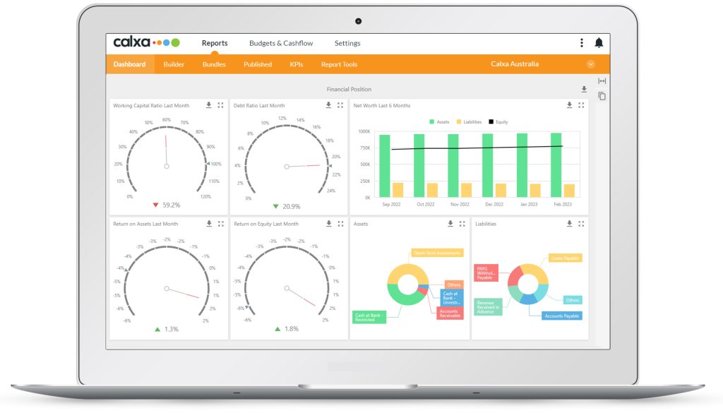
Financial Position Dashboard
The Financial Position dashboard shows what’s happening on your Balance Sheet, where you are at a point in time. For non-accountants these charts can be easier to grasp than a report with numbers.
- Working Capital Ratio, showing the relationship between your short-term assets and liabilities
- Debt Ratio, like the working capital ratio but comparing all assets and liabilities
- Return on Assets is your Net Profit compared to your total assets
- Return on Equity shows your profit compared to the equity you have in the business
- Net Worth shows your assets and liabilities month by month with the line for your net equity (the difference between them)
- Asset and Liability pie charts. These show the breakdown of your biggest assets and liabilities.
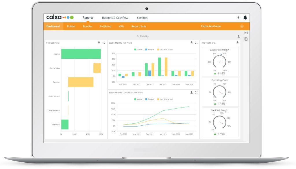
Profitability Dashboard
This one shows how much money you’re making. You may not have collected it (the Cash Management one will show you that) but you have earned it. The charts on this dashboard show:
- YTD Net Profit waterfall, showing how your income, cost of sales and expenses produce the net profit
- Net Profit last 6 months compares this year’s profit to last year and your budget, month by month
- Cumulative Net Profit last 6 months shows how your total profit grows, or shrinks, month by month
- Gross Profit Margin, showing the GP as a percentage of your income
- Operating Profit margin deducts expenses from your Gross Profit and is again shown compared to total income
- Net Profit margin takes into account any other income, other expenses you have.
New Dashboard Features
We didn’t just add the new dashboards! We also gave you:
- Export the whole dashboard, or any chart, to PDF, an image file or Excel. The spreadsheet export gives you a table of the underlying data.
- Expand the dashboard to full screen
- Use the dashboard for a consolidated group as well as any individual organisation
These dashboards will offer more choice to all users, especially those of you who don’t want to get their hands dirty with any customisations.
Stage 2: Empowering your Dashboards Will be New in Calxa
In a couple of weeks, you’ll get the next step in our dashboard journey. This will empower you to:
- Add dashboards directly to a report bundle
- Copy and modify existing dashboards
- Create new dashboards
- Copy charts from one dashboard to another
- Customise the layout of the dashboards
- Customise the charts using the available data – so changing bar charts to line charts
- Adding charts using Last Month and Year-to-date numbers for any of our default KPIs
For the serious customisation, you’ll need to wait a couple more weeks for Stage 3.
Stage 3: Exciting Dashboard Customisations
The most important part of what’s new in Calxa for dashboards will be the 3rd stage. Here, you will be able to create and choose your own data source. What’s a Data Source? It’s the collection of elements that determine what numbers are used in your dashboard chart. These can include:
- Account Trees, to filter and group the accounts you want to include
- Business Unit Trees to identify and group your selected business units
- Budgets to give you the comparisons you want
- Date Ranges, such as Year-to-date, This financial year, Last calendar year, Rolling 12 months and many more
There will be a bit of learning to get the hang of customising dashboards but it will be worth it for those of you who want to produce a particular set of charts. They’ll allow you to enhance and personalise the reports you produce each month, providing your audience with clear information.
To show you what’s new in Calxa, we have scheduled an Introduction to Dashboards webinar. This will help you learn about customising your dashboards. As always, you are most welcome to reach out any time you need a hand or simply book a session with our team.